(Re)Inntroducing Inngest: Our Brand transformation
John Butcha· 6/23/2025 · 4 min read
The keen eyed users of Inngest may have noticed we went through a bit of a change last week. Friday, we soft launched our new brand and identity. In addition to an updated logo and mark, we've rolled out a redesigned website featuring our new brand colors. We are beyond excited to finally get our new brand out to the public. It has been the culmination of months of hard work both from us and our partner Focus lab.
Why the need for an updated Identity?
Inngest as a product has been in a constant state of evolution. While core functionality remains the same, the product as a whole is almost completely unrecognizable when compared to 18 months ago. The Inngest team has focused the majority of our efforts on our product side, and the brand hasn’t kept pace. The idea of a rebrand has been floating around the team for a while, but it wasn’t until late last year that things really started to take shape. Our original logo came before my time at Inngest. Legend has it that it was born from Tony fiddling around in Figma for 20 minutes. Over time, the mark was dropped entirely and we stuck with just the logotype. Utilitarian? Sure. Memorable? Not really. Fast forward to the Q42024 when approaching this project, one key theme continued to pop up: intention. Intention to move forward. Intention to create something that feels like us. Intention to design a brand we could grow into. That mindset guided everything, from choosing Focus Lab as our partner to shaping the identity you see today. Focus Lab helped lay the foundation, and from there we took the baton, expanding and refining the work until it truly felt like Inngest. What you see now is the product of that collaboration. This new brand isn’t just about where we are today. It’s built to grow with us as we keep building toward the future.
The concept
Our concept and direction, "unlocked," emerged from extensive brainstorming with various stakeholders, combining brand attributes, archetypes, and strategic insights. At its core, Inngest is a foundation that empowers developers to do more, to unlock creativity, speed, and growth. We wanted our brand to reflect that.
A non-traditional, non-locked up logo system was designed following this, “unlocked” concept definition.

The primary logo is meant to communicate reliability and durability. It adds human elements and organic shapes in cut outs reminiscent of traditional typographic inktraps in traditional printing processes. We are using this to evoke a feeling of familiarity while still pushing the boundaries of what is expected.

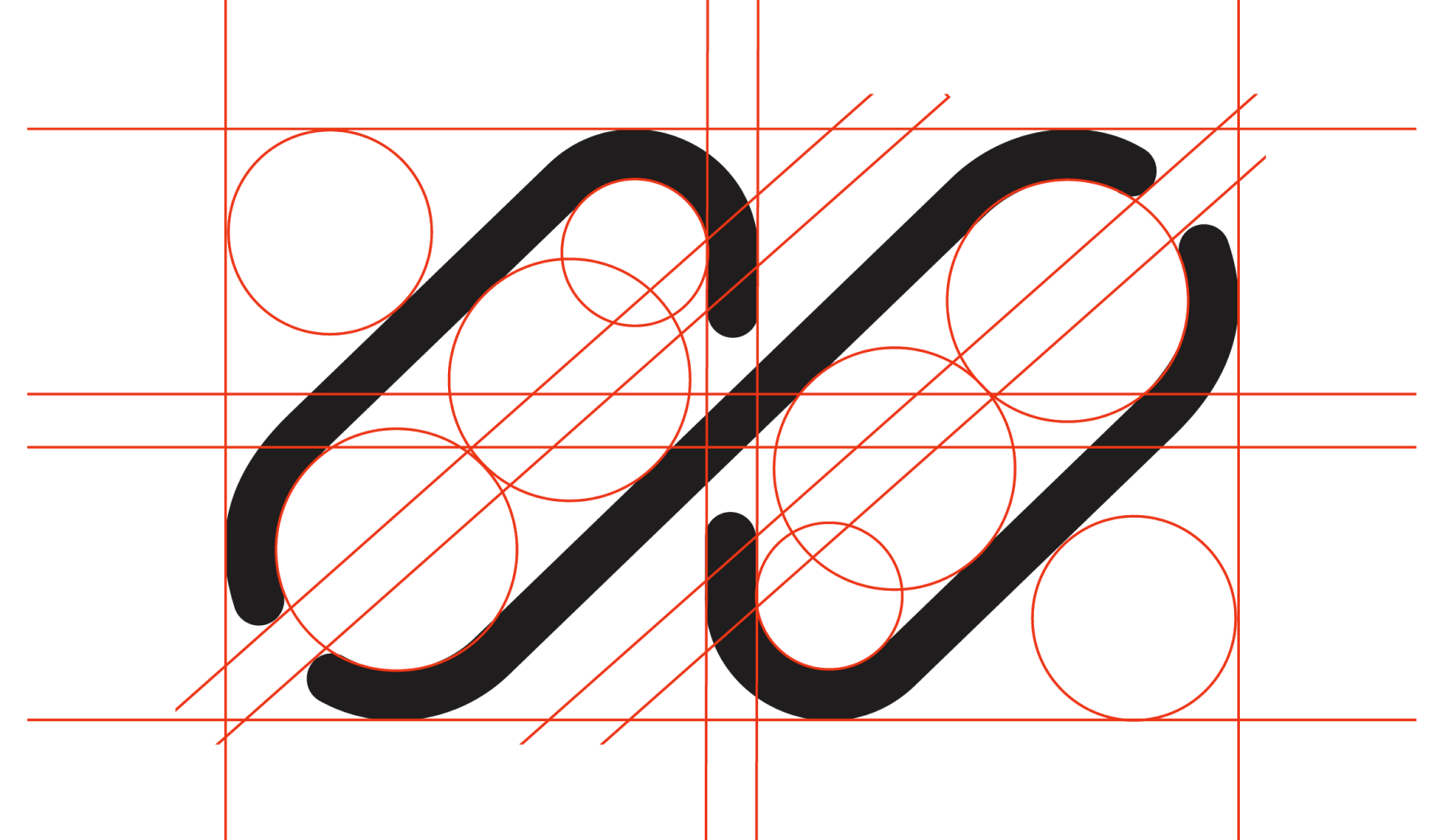
The mark itself is used as a supplement to the primary logo. A graphic to embody the brand in isolated instances and carry enough weight to speak on its own. The mark connects and relates to the geometry of the inktraps found within the primary logo. A variable weight system was designed in order to allow for the mark to be applied in different contexts. The mark itself incorporates a good amount of symbolism and metaphors., but, I’ll leave interpretation up to our users’ imagination.
The visual style on our website is a play on puzzles. Before Inngest, building reliable, scalable backends would take months of work by piecing together a complex architecture of event streams, queues and workers. Today, you complete that puzzle by using one simple abstraction: step.run.
Wrapping up
The Inngest team is really proud of how the new brand turned out. But more than anything, we’re excited about what it unlocks for us moving forward. It’s not just a fresh coat of paint. It’s a reflection of who we are now, what we’ve built, and the developers we’re building for. It finally feels like Inngest. Also, we’re hiring! Now that the brand structure is in place, we’re looking for a Communications Designer to help bring the brand to life across every Inngest touchpoint. Huge shout out to our partners at focus lab, the internal Inngest team, and you — our users. Stay tuned for what the future holds (I promise it’s more than a cheeky sticker or two).